


 Build a report when a preset does not answer your question. It saves its source, columns, widths and date range for reuse.
Creating a report needs Create reports permission. Changing an existing one needs Edit
reports and edit access to that report.
Create the report
1
Start a new report
Go to Reports and choose New report.
2
Choose its layout
In Create view, choose Table for one configurable table or Report for a dashboard of
table and chart blocks.
3
Name and create it
Give the report a name, choose who can see it, then select Create view.
Choose what to measure
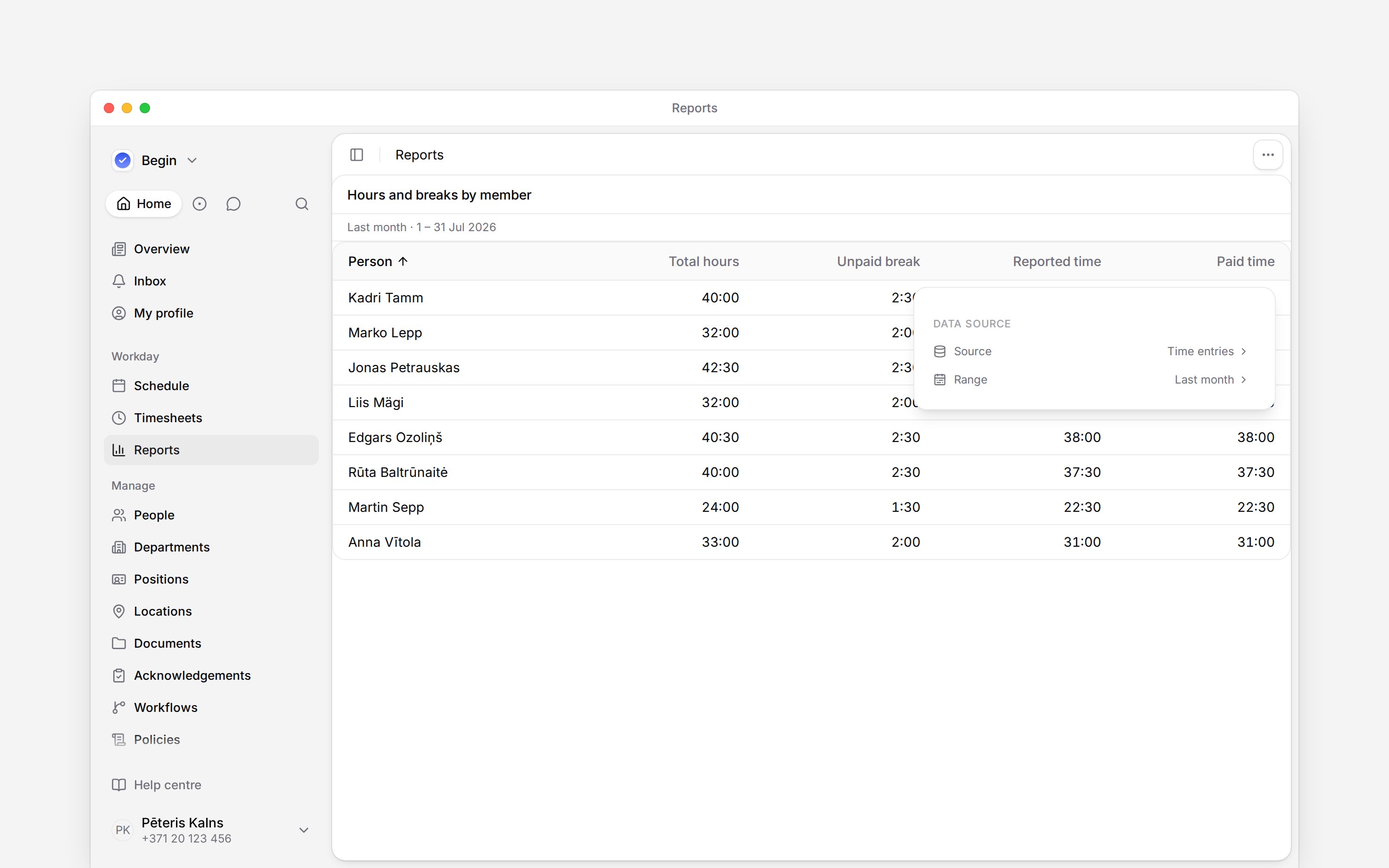
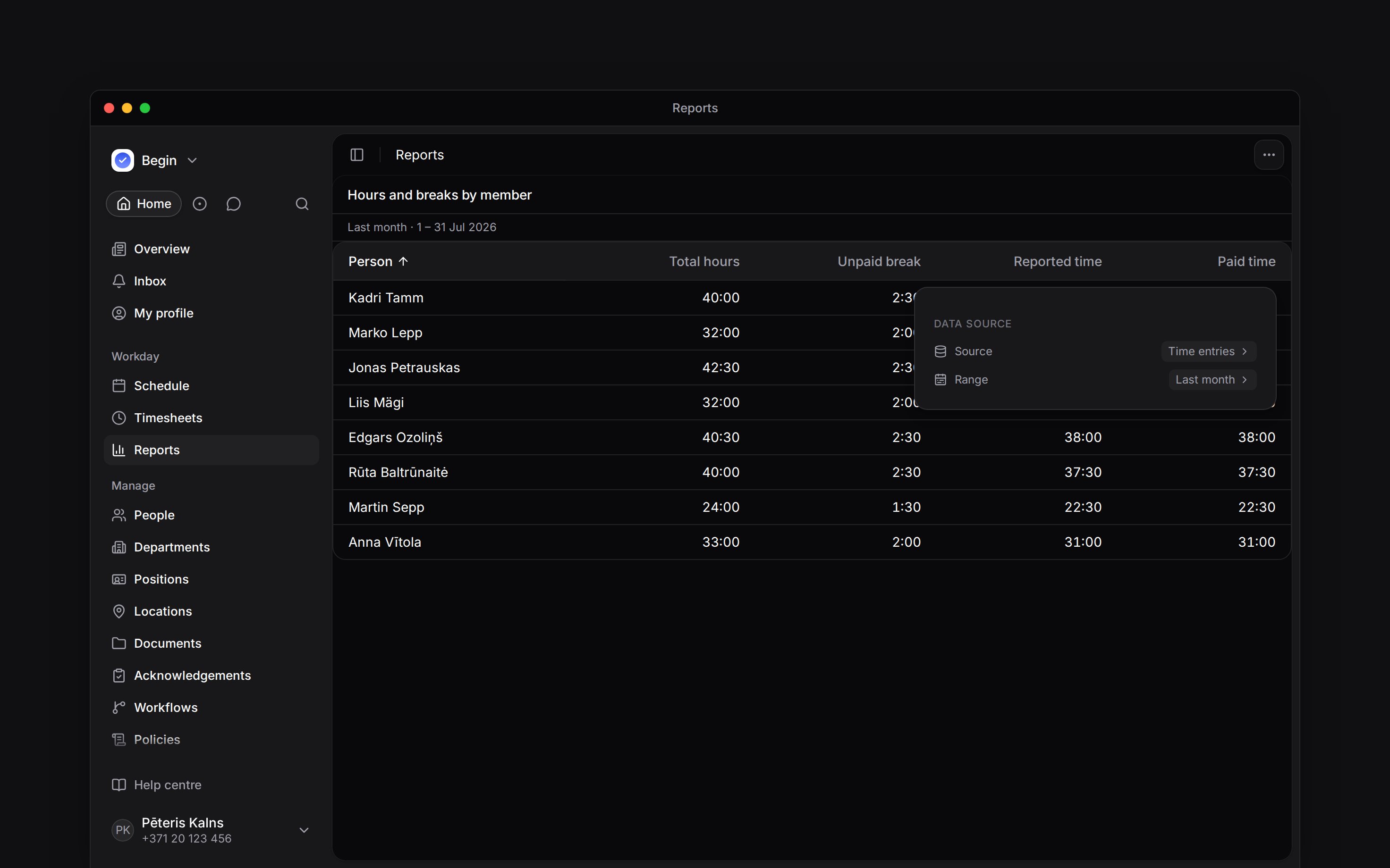
Open the settings and choose Source.
Shifts counts shifts only; availability, unavailability and time-off blocks are never counted.
Set Summarise by to None to inspect individual records. Choose Person for calculated hours, or choose another grouping when you need counts or record totals by position or location. Calculated hour columns that need a person are unavailable in other groupings.
When you group individual records, each section heading counts all matching records, including rows that have not loaded as you scroll.
Choose the columns that answer your question. For example, put Total hours, Unpaid break and Paid time beside each other to check how breaks affect paid hours. The hour columns explains the differences.
Identification number and Payroll export code columns need both people access and View private details for each person. If either permission covers only part of your team, the columns show values only for people covered by both.
A column heading wraps onto up to three lines, so every column shows its full name, and a column never gets narrower than its heading needs in your language. Drag a heading’s right edge to widen or narrow its column. A column’s menu opens from …, a right-click, or on a phone or tablet a tap on its heading. To move a column, drag its heading; on a phone or tablet, rest a finger on it, then slide. Move left and Move right in the column’s menu do the same without dragging. In a person summary the Person column stays first. Everyone reading the report gets the saved width, except that a 390px-wide phone caps the name column at 160px, or at its heading’s width where that is wider, so other columns remain reachable. Presets and reports shared with view access keep the author’s widths.
Long names, notes and labels wrap inside their columns, including in print. A person summary’s Absences column names each policy with its days, other time included, such as “Annual leave: 2 days; Training: 1 day”, the same text a download carries. Report cells show names and labels in words, without avatars, icons or colour dots. If you can edit the report, widen a column when a long entry makes its row too tall.
On a chart block, Break down by splits a bar, horizontal bar, line or area into one coloured series per value. A pie or radial chart has no second dimension to draw with, so it offers no breakdown and refuses a saved one.
Set the period and filters
Choose Range before comparing figures. For payroll and period balances, use a whole calendar month, such as This month or Last month. A rolling range such as Last 30 days is not the same period. Filter narrows the records. On a report grouped by person, a Position, Location or Department filter keeps the people who hold it, with all of their work, so the result matches the position each row shows. On any other report it keeps the shifts or time entries that carry it. Check the saved Status filter: on both Timesheets and Shifts reports every calculated figure follows the selected statuses, so Pending or Cancelled shows the norm, overtime and period balance those records would give. With no status filter, a Timesheets report lists every status but calculates approved work only, so clearing the filter can add records without adding their hours to a calculated total. Ticking every status is different: it calculates every record. If you cannot edit the report, your filters apply to you only and are not saved. Duplicate the report to keep them.A filter that narrows a person’s work, such as a label, can make norm and overtime unavailable for
the people whose work it narrows. On a Shifts report a status filter never does. People the filter
leaves unchanged keep their figures. Open Info to see which rule applies.
Reuse the result
Open the report again to use its saved setup with current data. Each reader sees only the rows their permissions allow, and a row they can see may still hold back a column they cannot: on screen, a colleague’s absence lists without the reason behind it unless you have View others’ time-off details. A generated file asks the same question when someone opens it, so a reader whose access to the people or columns it covers has changed cannot download it; running the report again gives them a file with their current access. Click a person’s row to read the day breakdown, or share the report with someone who needs it. A person summary adds rows as you scroll through a large team or date range; the count above it covers the whole report. Name and position sorts order everyone before showing the first rows. An hours sort waits for every figure, so a very large report may ask you to shorten the range or filter. Sorting individual rows by person also needs every person first; on a team of several thousand, use another sort or filter. A list of records you have not sorted reads in date order: shifts and time off by when they start, time entries by date and then start time, and people by first name and then last name. An arrow beside each of those headings shows it. Sort by any column to replace it. Leave balances keep your team’s order.Next
The hour columns
Choose the figure that matches the question.
Reading a day breakdown
Follow a person’s total down to the days and records.
Still need help?
Contact support
Email the Begin team and we’ll get back to you.
Ask Begin AI
Open the AI assistant and get instant answers based on these docs.